This post was really written as a way for me to wrap my head around the shape of the non-central t-distribution and how it fits into power analysis I hope it might help someone else out there, too!
My previous two posts establish the foundations for this. In the first, I showed how sample means tend to be normally distributed, and still normally distributed if we divide them by their population standard deviation; but if we divide them by their sample standard deviation they are t-distributed. In the second, I showed how the  -distribution is built up as a pile of normal distributions of different spreads, but with the same mean. I’ll build on these two posts in the following.
This -distribution then forms a nice basis for testing a null hypothesis. Say we have a sample of size  , with mean
  and standard deviation
  . If we want to know whether that might have come from a population with zero mean, we can calculate a -statistic as
  , and see if that looks like the sort of -statistic that we’d expect to get by comparing it against a -distribution with
  degrees of freedom.
If our -statistic is in the outer, say, 5% of what we’d expect from a distribution with zero mean, then we say it looks less likely that our null hypothesis is true, and “reject the null” (etc etc).
For example, in my the first of the posts I mention at the start, I look at the example of choosing four numbers between -48 and +48 at random. The raw numbers themselves should have a standard deviation of 28. The mean of your sample of four would, on average, come out at zero, but will miss that by a sampling standard deviation of  . Dividing a given mean by this value 14 would convert it into a
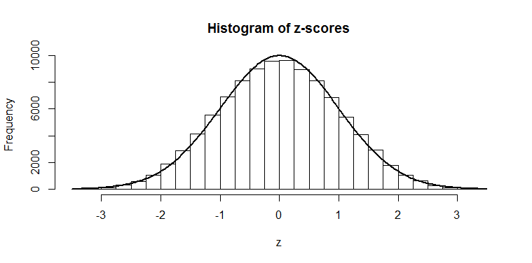
  -score, which could then be compared against a normal distribution. Dividing by its own sample standard deviation would give us a -score which could be compared against a -distribution.
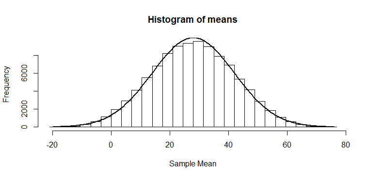
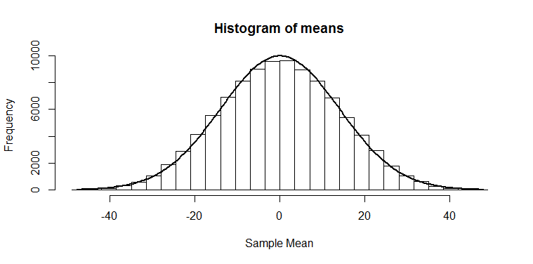
But what if our null is not actually true? Suppose we were instead choosing from the numbers -20 to +76? These numbers have the same standard deviation as before, but are shifted up by 28. Suppose we do as before: we want to see whether our mean of four numbers looks like the sort of mean we might have got from a distribution with a mean of zero. We know that the means should be roughly normally distributed, just as in the previous post, but now with a mean of 28:
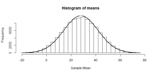
So, if we divide by 14 (the true standard deviation of the mean), as we would if we were trying to get a -statistic, we just squash that normal distribution, and again get another normal distribution:
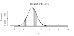
The mean of 28 also gets squashed to 1/14th its original size; of course, these don’t look -distributed, since the mean is not zero, but that is the point: half of our -statistics would be above 2, which would give us enough evidence to conclude that our sample is not consistent with one from a null hypothesis of zero mean and standard deviation of 28. So, in this example, we could conclude that we’d have 50% power.
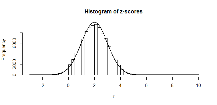
At first look, you might think that calculating the power for a -test should be equally as simple, but let’s look at the histogram for the -scores that we would get if we divided each of our means by its own sample standard deviation:
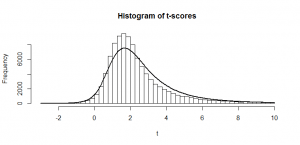
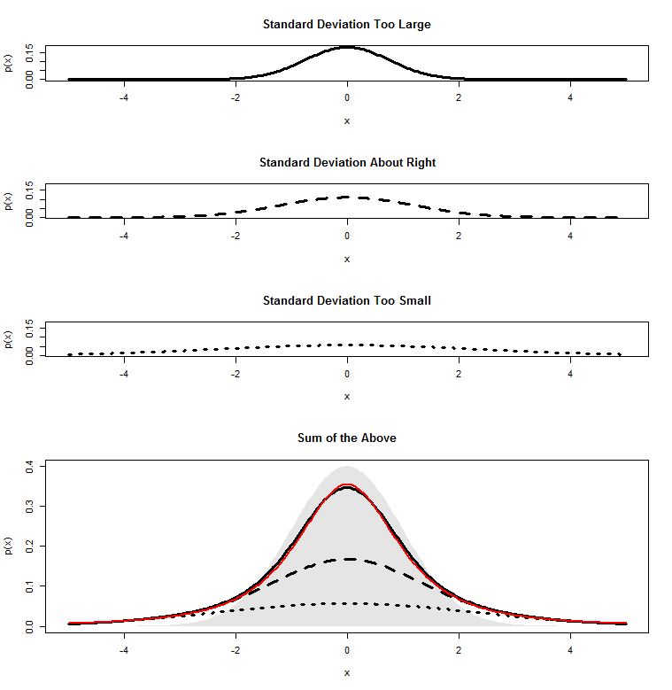
This is lop-sided and doesn’t look anything like a -distribution. The curve that I have fitted is called the non-central -distribution and it is what we get in a situation like this. (It is a slightly rough approximation here because our raw numbers didn’t come from a normal distribution–more on this in a later post!) To understand why we get this lop-sided shape, first make sure you understand what I’m talking about in this previous post. Let’s take the code from the bottom of that post and tweak the value ncp (the “non-centrality parameter”) in this code to 2. I have chosen 2 because that is the mean of my -scores. Here’s what comes out:
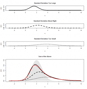
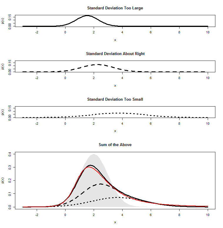
When we’re dividing by a sample standard deviation that is “about right”, the mean of our means does indeed get squashed by a factor 14 and comes out around 2. But, when we get a sample standard deviation that is too large, it gets squashed even more, and the whole distribution gets squashed closer to zero, further to the left. Where the sample mean comes out too small, we don’t squash our distribution enough, so we end up spread out further to the right. When we add all these together, we get a skewed distribution. And this is the non-central -distribution. In this case, we have a -distribution with three degrees of freedom a non-centrality parameter of 2, which is the curve I fitted to the above graph.
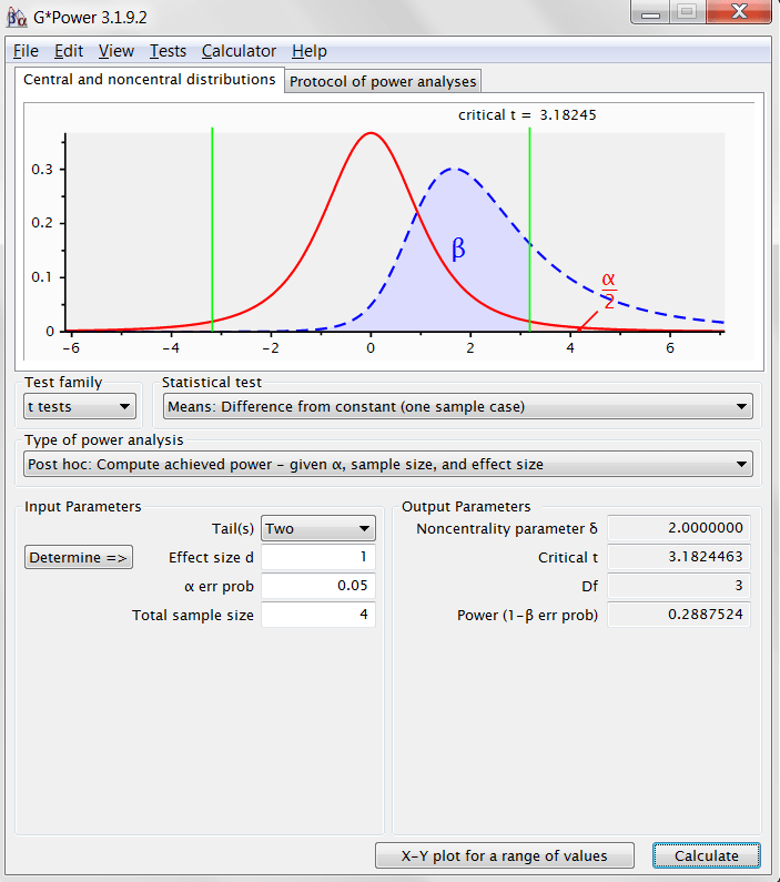
From here, calculating power is easy. In my -test, a p-value below 0.05 corresponds to the 2.5% in each tail of our central -distribution. To keep this simple, I’ll be slightly lax and only consider the right-hand 2.5%, since I know in this example that I’ll almost certainly be to the right. In R, I can find my critical value for the -test using the following code (or I can find it in the table in the back of a statistics textbook):
> qt(.975,df=3)

[1] 3.182446
So, any -statistic above 3.18 I will declare to be statistically significant, informing me that this sample did not likely come from a distribution with zero mean. In this example, we know that the -statistics we’ll actually get will follow a non-central -distribution with non-centrality parameter of 2. All we need to do is to find out what proportion of this distribution will lie above the critical value and be declared statistically significant, which I can calculate like this:
> 1-pt(3.182446,df=3,ncp=2)

[1] 0.2885487
So, we achieve 29% power. Let’s set this up in G*Power to see if this makes some more sense of the numbers that come out of this handy piece of power-calculating software (also free, check it out!) The effect size is a Cohen’s d, which is just the distance of the true mean from the null hypothesis mean, divided by the population standard deviation: in our case that is  . All the other numbers in this output should now make perfect sense to you!
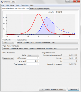
And, phew, G*Power agrees with our computed power.

 where
where  is the standard deviation of the numbers we started with and
  .
. ,
,
 . This also agrees with the histogram of means, where we can see there were not very many cases above 28. This is a
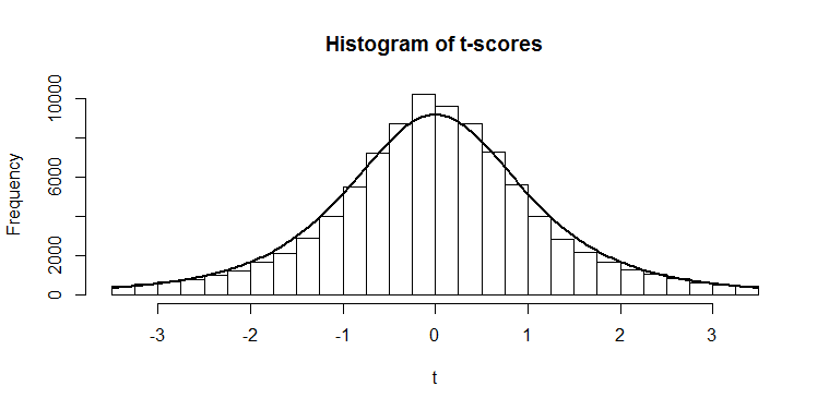
 ). You can see it is fatter at the edges; we saw that there was only a 2.5% chance of getting a