You might find this article interesting if you’re curious how the chi-Squared tests (such as goodness-of-fit) really work, but don’t feel you have the mathematical background to tackle the linear algebra that is involved with proving how they work. Instead of mathematical derivations, I’ll try to explain the tests through graphs and diagrams, so that you can gain some intuitions about what is going on inside the chi-squared tests. If you feel comfortable with more advanced mathematical concepts such as vectors and matrices (linear algebra) you might find my other post here more succinct/precise.
One of the reasons I wrote this was a realisation that there isn’t (as far as I could find) another post out there that really conveys the workings of the test (correctly) without fairly complicated maths. There are a few sites out there that try to simplify it, but they get it quite far wrong (by the end of this, I hope you’ll have the intuitions to see that they are indeed wrong). And wrong intuitions lead to people using the test in ways that simply don’t work, and I have seen this in my job many, many times.
To develop these intuitions, I’ll also need to introduce the chi-squared distribution. You might think this distribution is only really useful for chi-squared tests, but actually, the chi-squared distribution underlies almost every single parametric test that you will meet in an introductory stats course (t-tests, ANOVA, linear regression, ANCOVA, polynomial regression, all derive their p-values by means of chi-squared distributions) and the intuitions we’ll develop here can be extended to allow you to understand how these tests really work, in a much cleaner, more obvious way. In turn that will give you a clear understanding of concepts such as degrees of freedom, and type-I sums of squares, and how all the first parametric tests you learn are effectively the same test, rebadged. I will write a post on this, when I get the chance. But, for today, chi-squared, and in particular, the goodness-of-fit test. (The test for association is just an extension to this, but is a good deal harder to visualise).
You might gather, looking at the rest of this blog, that I have a small fascination for the chi-squared test. I find it fascinating that this test is so outwardly simple, so simple that it is often the first hypothesis test that a student will be taught, but whose workings under-the-bonnet are far more complicated than they seem to appear. It leaves us with this enigmatic formula ^2}{E}")
The Chi-Square Distribution
The one kind of distribution most people are familiar with is the normal distribution. Let’s start with that. Say, if I randomly picked 100 American men, their heights (in cm) might correspond to the dots on this:
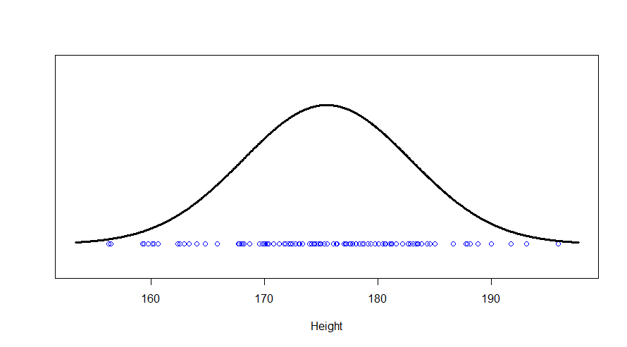
We see a big clump of people in the middle (the peak in our bell-curve indicates that we expect to find a lot of people of these heights) and fewer people as we head out to the tails. We might consider those people out in the tails as being “unusual” in the sense of their height, and in statistics, we’re often hunting for things that look “unusual”. The heights are normally distributed, but if we subtract the mean (175 cm) and divide by the standard deviation (7.4 cm), we get “z-scores”. Z-scores are distributed as what we would call a “standard normal” distribution (one with zero mean and standard deviation of one):
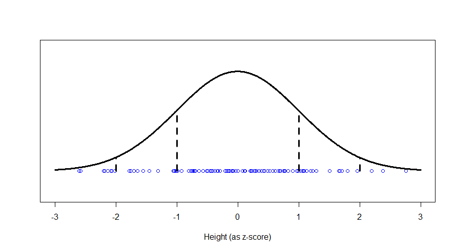
Now, this makes things much easier, because we know exactly what sort of z-scores are “usual”, and what sort of z-scores are more unusual. For example, 95% of all z-scores will lie between (around) -2 and +2. Those that are outside of those bounds, we very often consider “unusual”. Those between -1 and +1 are the most common.
Now, let’s suppose we are going to measure people’s intelligence too. To keep this simple, I’m going to assume that intelligence and height are not correlated at all. Then a plot of 2000 people’s heights vs their respective intelligences (as z-scores), might look like this:
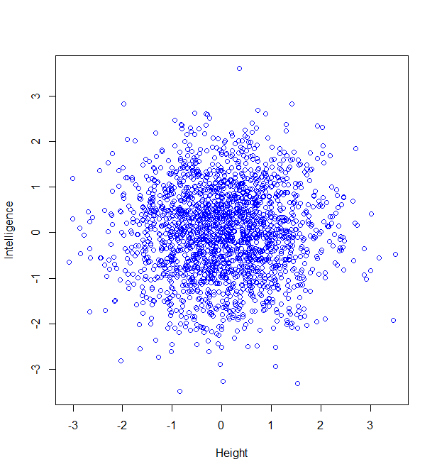
Now, maybe we want to find it if someone has a particularly unusual combination of intelligence and height? Someone who is extremely intelligent and extremely tall, for example. Well, this “bivariate” normal distribution seems to become sparser and sparser the further from the middle we are: in actual fact, one of the most wonderful properties of the normal distribution is that this happens in perfect circles (it might not sound that wonderful yet, but in later posts, we’ll see just how powerful this really is):
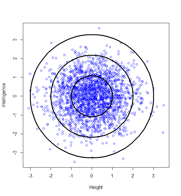
So, we can classify how normal someone is by their distance from the centre of this graph. For example, 95% of people will lie no more than a distance of 2.45 away from the middle:
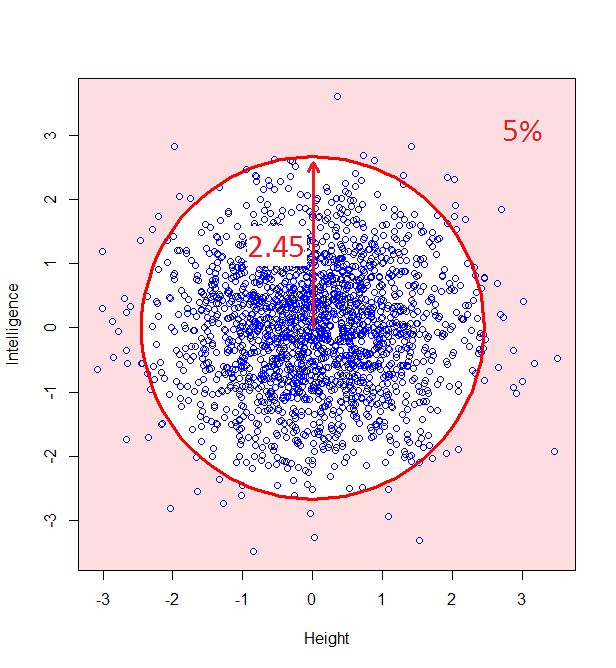
How do we calculate that distance? Good old Pythagoras theorem! If we square the height of a given person, square their intelligence score, and add those two squares, we get the square of the distance from the centre to their point on the graph.
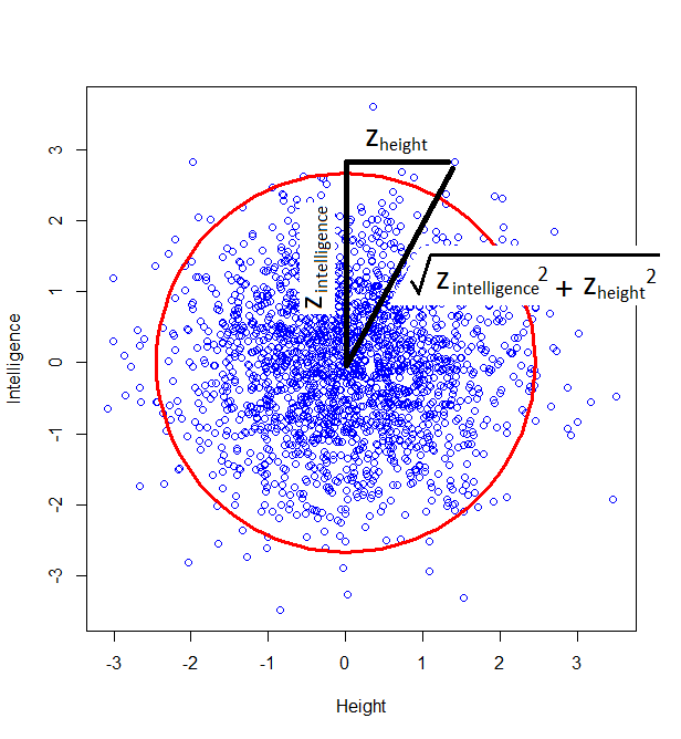
And this squared distance is the chi-square statistic. Obviously this was just the square of one standard-normal variable (height z-score) and another (intelligence z-score), and this gives us the idea of looking at the distribution of the sum of two squared normal variables: that distribution is the chi-square distribution with two degrees of freedom:

…and this confirms that, indeed, 5% of datapoints will lie at a squared distance greater than 6 (or an unsquared distance of 2.45).
The same idea stretches to as many dimensions as you want. If we have three (uncorrelated) z-scores, they form spheres:
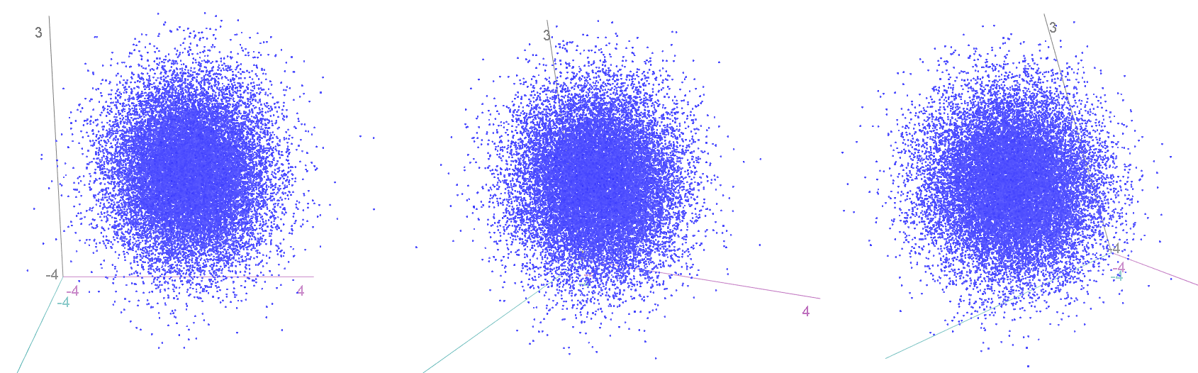
…and we can again calculate how “unusual” a particular combination of values is by finding the squared distance from the centre. This is calculated by an extension of Pythagoras (“Euclidean distance”), again by summing up the three squared individual values, and comparing to a chi-squared distribution with three degrees of freedom.
We can go on like this into as many dimensions as we want, the same always holds. And the degrees of freedom of the chi-squared distribution just represents the number of independent normal distributions we are combining.
The Chi-Squared Goodness-of-Fit Test
First things first, let’s make sure we have a definition of the goodness-of-fit test that is actually correct. The most common definition that I have seen is that it is a “test for count data”. While there is a kernel of truth to that, I have seen far too many instances where that has been misunderstood and the test has been wrongly used. I’ll explore some of those abuses in a later post, and we’ll see why they don’t work, at least without a few modifications to the test.
The goodness-of-fit test should instead be thought of as a proportion test. In a later post, I’ll describe how ANOVA generalises a t-test to test more than two means by replacing a normal distribution with a chi-squared distribution; the goodness-of-fit test generalises the proportion test to work on proportions of more than two categories in exactly the same way, as we’ll see. So, it’s a proportion test that can handle more than two categories.
Let’s start with an example where we are looking at the proportion of just two things, so that we can compare it with a proportion test. Say I’m going to toss a coin 100 times. How many heads will I get? On average, we might expect we’d get about fifty heads. This is our “expected” number of heads, which we’ll refer to with the letter “E”:

where 

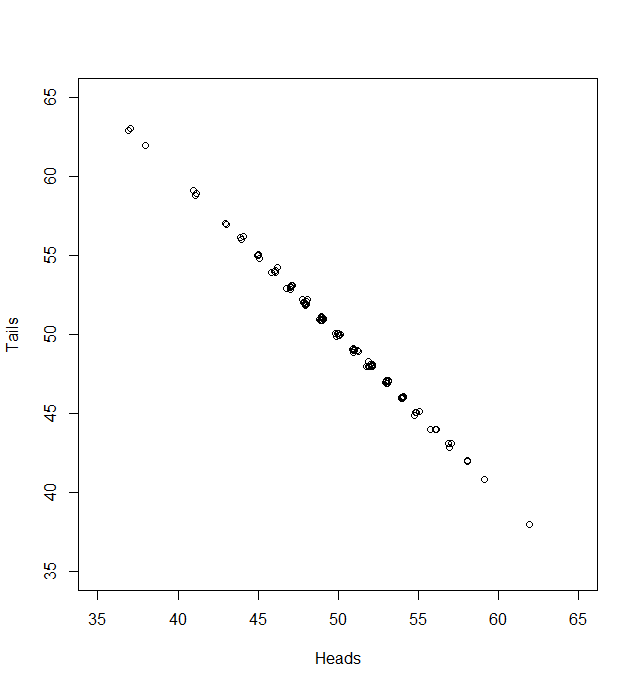
But, of course, we might not get exactly 50 heads. Let’s try repeating this experiment a hundred times and see how many heads we get each time:
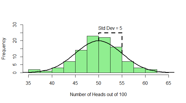
Sometimes we get 55 heads, or 45. It’s not even that unusual that we get 60 or 40 heads. If we got 80 heads, we might start wondering if we really had a fair coin. By comparing our result to this histogram, we can figure out if our result looks like the sort of result we’d get from a fair coin (and, if not, we call our result “statistically significant” and reject our null hypothesis of a fair 50/50 coin).
Notice how much it looks like a normal distribution? This is actually a binomial distribution, but if we toss the coin enough times, it turns out to look (almost) exactly like a normal distribution, and we know from the properties of the binomial distribution what mean and standard deviation this normal-ish distribution will have:

} = \sqrt{E} \times \sqrt{1-p}")
which, in our case, is


So, if we subtract the mean (50), and divide by the standard deviation (5), we can do just as we did at the start with our heights: subtract the mean, and divide by the standard deviation and the result is a 

where 
But the goodness-of-fit test takes a slightly more circuitous route to the answer. We’ll see why in a moment. After subtracting the mean (


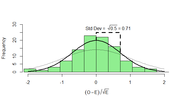
What can we do with this? We can’t compare it with our standard normal (which is dotted onto the graph for comparison). To see how this will work out, we need to consider both the number of heads and the number of tails:
Now, if we subtract the expected number of heads from the heads and divide by 
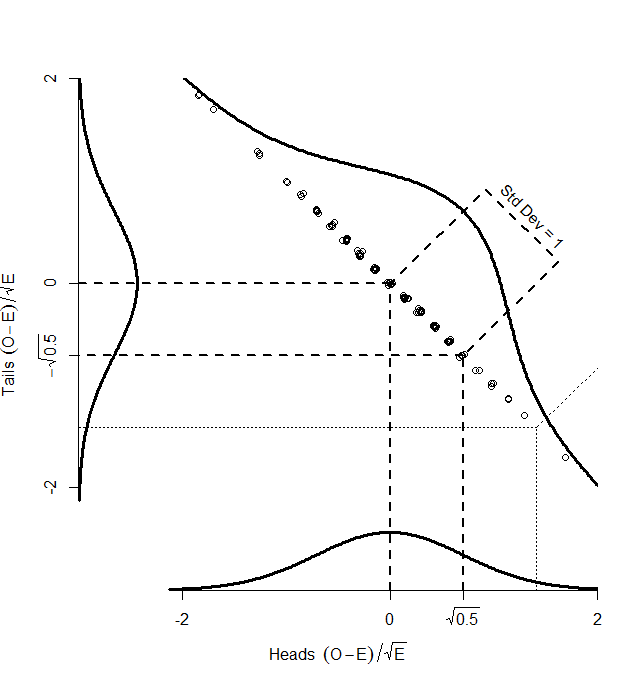
While the numbers for the heads and tails separately do not have standard deviation of 1, the dots make a diagonal pattern of a normal distribution that does have a standard deviation of 1. If you don’t believe me that this pattern has a standard deviation of 1, it’s just another application of Pythagoras’ theorem to the two standard deviations that make it up:
^2+(\sqrt{.5})^2} = \sqrt{0.5+0.5} = 1")
So, if we find the distance of each point on the graph from the centre (0,0), that distance is standard normal, and we can compare it with the numbers in the back of our text book. How do we find that distance? Pythagoras’ theorem, of course:
^2+\left(\frac{O_{tails}-E_{tails}}{\sqrt{E_{tails}}}\right)^2")
which we can simplify to the standard chi-squared formula:
^2}{E_{heads}}+\frac{(O_{tails}-E_{tails})^2}{E_{tails}}")
So, we could take the square root of this, and compare it with the standard normal numbers in the back of our book. Or we could not take the square root, and compare it with a chi-square distribution with one degree of freedom (since a chi-square distribution with one degree of freedom is just the square of one standard normal).
So, the key point here is that, although we have two different observed counts, a scatterplot of them can only scatter away from the centre in one direction — the graph has been squashed flat. That is because we are dealing with proportions, so that if we gain one extra head out of our 100, we must lose a tail. And in the one direction that it can move, it is normally distributed with standard deviation of 1. So, our graph is made up of one single, standard normal distribution, and the squared distances from the centre will be chi-square distributed, with one degree of freedom.
Now, that might seem like a lot of hassle compared with the standard proportion test. But the beauty of the goodness-of-fit test is what happens when we have more than two possible categories.
Suppose we ask 99 participants to choose their favourite tinned meat, out of Corned Beef, Stewing Steak, and SPAM. We might hypothesise that none is really better than the other, so we should see an equal proportion of corned beef-, stewing steak- and SPAM-lovers in the population. But we have just 99 participants from this population, and so we can’t necessarily expect that we’ll get exactly 33 of each, since randomness is involved. Perhaps we have 32 corned beef, 32 stewing steak and 35 corned beef lovers. Is that sufficiently different from the expectation of 33 of each to disprove our original, “null”, hypothesis?
Let’s again simulate running this experiment many many times, calculate
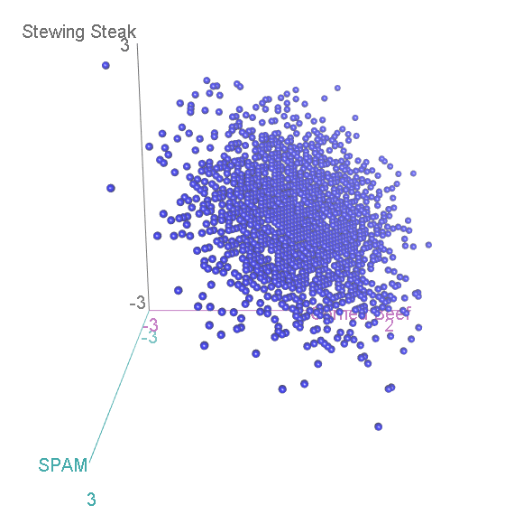
Now, we have three categories, and the scatterplot is three-dimensional. If we rotate to look side-on, we can see that, again the scatterplot is squashed flat in one dimension:
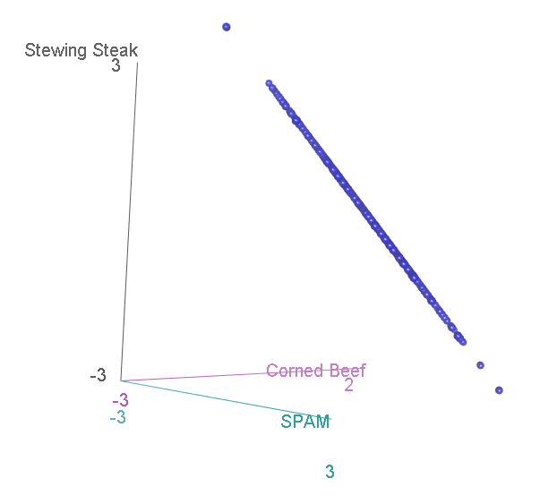
This shouldn’t be a surprise. After all, it is not possible to accumulate an extra person preferring SPAM without also losing someone who likes either Corned Beef or Stewing Steak. Now let’s look at it face-on:
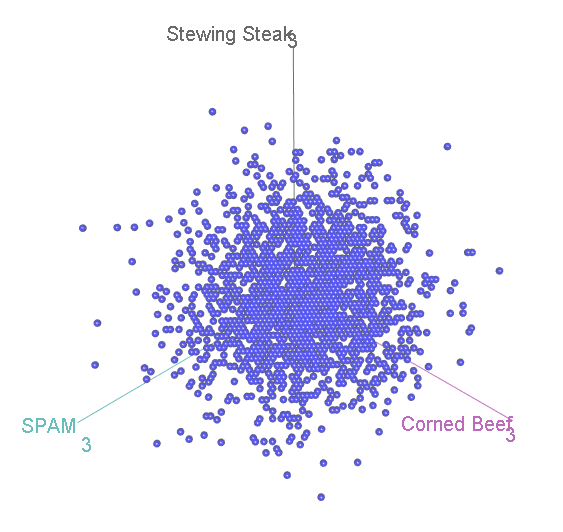
This might look familiar to you? A bit, perhaps, like that scatterplot of height vs intelligence at the top:
…Actually, it is distributed in exactly the same way, again floating diagonally across a three-dimensional space. And, remember, we can look for unusual cases in this scatterplot by comparing the squared distance from the centre with two-degree-of-freedom chi-square distribution.
The proof that this is distributed in exactly the same way is quite complicated, but it leads to a very simple final solution that shows that this will hold, no matter how many categories we are dealing with. With ten categories, we have nine normal distributions lying diagonally across a ten-dimensional space, and we can compare our squared distances with nine degree of freedom chi-square distribution.
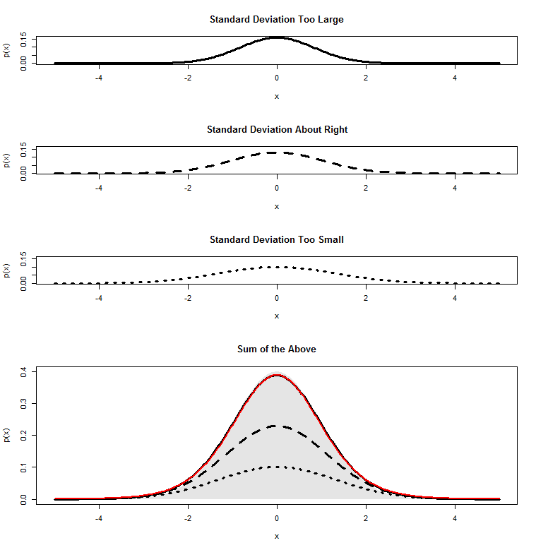
 -distribution is built up as a pile of normal distributions of different spreads, but with the same mean. I’ll build on these two posts in the following.
 , with mean
  and standard deviation
  . If we want to know whether that might have come from a population with zero mean, we can calculate a
  , and see if that looks like the sort of
  degrees of freedom.
  . Dividing a given mean by this value 14 would convert it into a
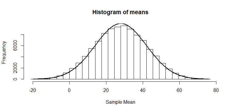
 . All the other numbers in this output should now make perfect sense to you!
 where
where  is the standard deviation of the numbers we started with and
  .
. ,
,
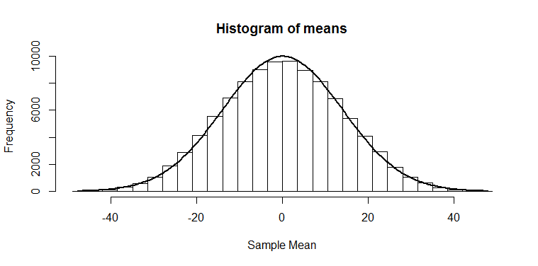
 . This also agrees with the histogram of means, where we can see there were not very many cases above 28. This is a
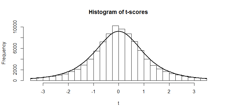
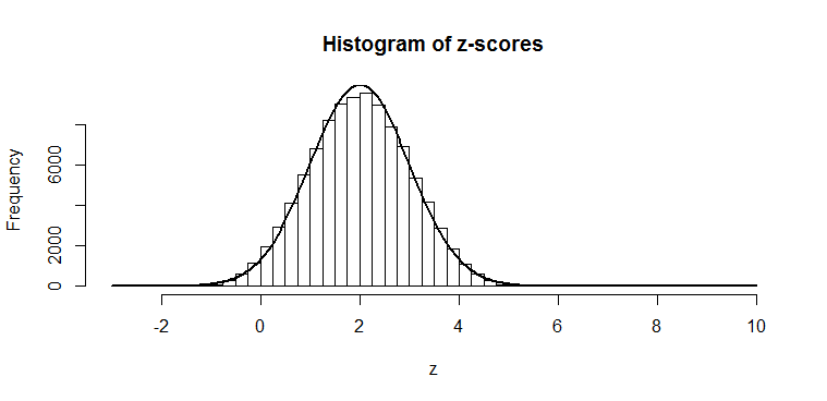
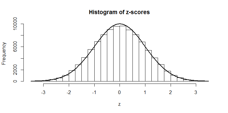
 ). You can see it is fatter at the edges; we saw that there was only a 2.5% chance of getting a
 ") should have a known distribution. I’ve spent my morning today working through a few derivations for this, and it’s some dense stuff! I haven’t yet looked at the full multi-dimensional proofs, so I am no expert by any means, but I have managed to get my head around the proof of a simplified Wilks’ theorem
should have a known distribution. I’ve spent my morning today working through a few derivations for this, and it’s some dense stuff! I haven’t yet looked at the full multi-dimensional proofs, so I am no expert by any means, but I have managed to get my head around the proof of a simplified Wilks’ theorem  will refer to the log likelihood,
 =\mathrm{log}p(x;\theta)") . The whole derivation is based on simple Taylor expansions around either the maximum likelihood parameter estimate
. The whole derivation is based on simple Taylor expansions around either the maximum likelihood parameter estimate  or the (null hypothesis) true parameter
  . This seems sensible, as these two should be relatively close to each other. To keep things simple, I will discuss as if the log likelihood
 ") were quadratic — which, by our expansions, we are assuming to be true locally, anyway. (And for a normal distribution, this will not be an approximation; another beautiful thing about the normal distribution is that the log likelihood is a quadratic!). Here, then, is a plot of
were quadratic — which, by our expansions, we are assuming to be true locally, anyway. (And for a normal distribution, this will not be an approximation; another beautiful thing about the normal distribution is that the log likelihood is a quadratic!). Here, then, is a plot of 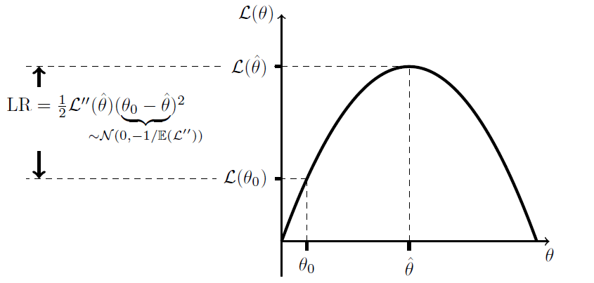
=0") since we are at a maximum on the likelihood surface; this is why there is no linear term in our expansion. The key to the proof is the claim in the underbrace, that
since we are at a maximum on the likelihood surface; this is why there is no linear term in our expansion. The key to the proof is the claim in the underbrace, that =-1/\mathbb{E}(\mathcal{L}'')") . If we can prove that this is true, then we are done: it is clear, in this case that
. If we can prove that this is true, then we are done: it is clear, in this case that ") . Though, that does assume that the curvature in the log likelihood surface for our data
. Though, that does assume that the curvature in the log likelihood surface for our data  is close to its expectation.
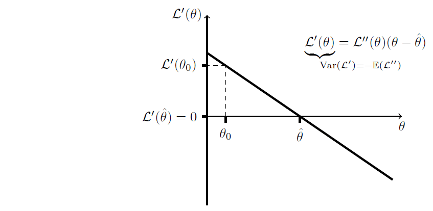
") is normally distributed, then so too should be
is normally distributed, then so too should be ") . And, indeed, the log likelihood is found by summing the log likelihoods across all datapoints, each of which is i.i.d., so central limit theorem gives us that it is (asymptotically) normally distributed, and so too should be its derivative
. And, indeed, the log likelihood is found by summing the log likelihoods across all datapoints, each of which is i.i.d., so central limit theorem gives us that it is (asymptotically) normally distributed, and so too should be its derivative =\sum_i \mathcal{L}'(\theta;x_i)") .
.") for a given datapoint is known as the Fisher information, and there is a nice clean, simple proof that
for a given datapoint is known as the Fisher information, and there is a nice clean, simple proof that =-\mathbb{E}(\mathcal{L}_i'')")
 , then
 =\sum_i\mathrm{Var}(\mathcal{L}'_i)=\sum-\mathbb{E}(\mathcal{L}_i'')=-\mathbb{E}(\mathcal{L}'')") .
. = \mathrm{Var}\left(\frac{\mathcal{L}'}{\mathcal{L}''}\right) \approx \frac{\mathrm{Var}(\mathcal{L}')}{\mathbb{E}(\mathcal{L}'')^2} = \frac{-1}{\mathbb{E}(\mathcal{L}'')}") .
.") , while
, while  we are treating as a random variable. This relates to Slutsky’s theorem, which I won’t go into here, but a simple way to view this is that
  = 0 \neq \mathbb{E}(\mathcal{L}'')") so, as numerator and denominator above get closer to their expectations, the variance is really driven by
so, as numerator and denominator above get closer to their expectations, the variance is really driven by